
The tools people use to interact with content on the internet are constantly growing and changing. Today, most people depend on smartphones to browse through websites. Unfortunately, traditional sites are largely incompatible with smartphones.
Even worse, Google has been changing its algorithm to penalize sites that are incompatible with mobile devices and reward mobile-friendly sites. While some site owners may bash Google for this move, let’s be realistic – navigating an old site on mobile is cumbersome and difficult.
Mobile site design goes beyond accounting for the different screen sizes. Let’s look at the UX differences between mobile and desktop site designs you should focus on for a better experience.
But first;
Why Should You Care About the Differences?
Businesses create websites for various reasons; at the top of that list is to attract and convert users into customers. It may be obvious, but the best way to achieve this is to ensure users become repeat customers or spend significant time on the site. If a user doesn’t like your site, they’ll bounce off fast and probably never return.
Moreover, mobile usage has increased exponentially over the last decade, and the trend continues. With about 7.26 billion users worldwide in 2022, and 59.46% of it being mobile traffic (as of October 2022), it’s only logical to have a mobile site too.
As you ponder on making a mobile site to complement or replace your desktop site, here are some differences to know.
Content Layout
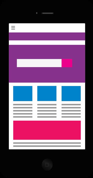
We mentioned that the differences between mobile and desktop site design surpass screen size. While it’s true, screen size is a large factor in mobile site design.
With a smaller screen, you have lesser room for graphics, text, and other content. So, to optimize mobile site design, you need to lose some content and prioritize others. This means reducing the word count on some pages, reducing graphics, and leaving secondary information for other site pages.
Unfortunately, this is easier said than done because you’ll need to develop a criteria for shaving content and apply it across the board. A great rule of thumb is to retain content that adds the most value and leave out elements that increase loading times on 3G networks.
With that said, we should also point out that mobile sites, unlike desktop sites, have the benefit of landscape and portrait screen views. This may be good or bad for site owners and designers. The orientation options may allow for better personalization and function, but they may require twice as much work to pull off.
Navigation and Input

To navigate and enter details on a desktop site, users often have a mouse and a keyboard (sometimes a touchscreen feature). Smartphone users don’t have access to physical keyboards and a mouse. Instead, they are fully reliant on touchscreen features on their screen. Different mobile gadgets have varying touch technology.
If your users need to type anything on the site, you should provide a keyboard. This will help make the input process comfortable depending on what needs to be inputted. For instance, if you need a ZIP code or a phone number, provide a numeric keyboard instead of a regular keyboard.
Navigation is easier on mobile sites with vertical alignment. Moreover, you can improve the user input experience by providing predictive text features. This will help the user fill forms faster and reduce typos.
Another way to make navigation and input easier on mobile sites is to reduce the fields that need attention. For instance, you may have the first name and second name field separate on a desktop site. On a mobile site, combine these two.
Menus
Menu formats are a big difference in mobile and desktops. On desktop sites, it’s okay to use detailed menus with numerous categories and sub-categories. After all, most users have large screens and can see the small texts clearly and smoothly click on links. On the flip side, mobile gadgets have considerably smaller screens, and users’ thumbs are large in comparison.
When designing mobile menus, consider this fact. You should only have single-level menus with large buttons and text. The arrangement should be vertical with several options. On mobile sites, the menus should collapse and expand as a user narrows in on a specific category.
Conclusion
Mobile site design is a different ball game from desktop site design. Users interact differently with mobile devices, and technology is growing and changing fast. Users are tapping on screens, spending lesser time browsing, and interacting with sites on the go. All these factors necessitate a different site to your primary desktop site.
But this doesn’t mean you abandon your desktop site because it’s not a thing of this or that. If anything, you should strive to improve the experience on both to grow your business.