
Over 50% of Americans spend over five hours on their phones, which has created a spike in mobile app development. However, to grasp and keep the attention of these users, you’ll need excellent UX mobile design.
Unfortunately, the smaller screens and short attention spans don’t leave you much wiggle room for crazy designs. If you’re having a difficult time designing an app users will love, here are some tips that’ll help your design.
Start with the end in mind
As you embark on a new project, you’re psyched and cannot wait to implement the new idea. You’re tempted to start drawing and designing mockups to get the ball rolling and avoid getting distracted. While the intention is great, hold off the temptation and deep dive into researching your user.
While you think your app is golden (it very well may be), there’re app nuances and needs only the end user can guide. Remember, the goal is to design an app that the target audience resonates with.
Comprehensive research entails running a competitive analysis. Locate apps similar to what you have in mind. Take note of bits of the apps you love, those you don’t, and why.
Also, create user personas to understand better how the user will interact with the app. What content are they expecting, and what activities will they conduct?
Offer simple navigation
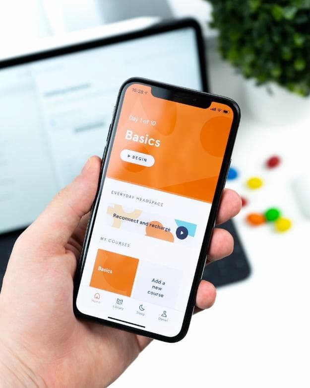
Simple navigation makes moving from screen to screen obvious. Without simple navigation, even the best features and compelling content are useless if your user cannot find them.
You can achieve simple navigation by:
- Ensuring navigation is familiar to users. People love when apps meet their expectations. You can do this by using navigation patterns your target audience is used to. This way, there’s little to no learning curve in use.
- Formulate good information architecture. It should be clear and logical and require minimal steps to reach a destination.
- The navigation should take focus away from app content. Instead, it should play a supportive role
- Communicate the current location. The user should always know their location in the app to navigate successfully.
- Be consistent. Your navigation buttons shouldn’t be hidden on some pages. If anything, the navigation design and pattern should be the same across the app to avoid confusion and disorientation.
Use legible text
In comparison to desktops, mobile devices have smaller screens. Filling enough information on the small screens is always a challenge, especially since most users skim content. Some practical tips to make text legible include:
- Choose a font that works well in different weights and sizes to maintain usability and readability in any size. Your best bet is to use the platform’s default font. For instance, Noto and Roboto are standard fonts for Android, while any font in the San Francisco family is ideal for iOS.
- Use at least font size 11 so that users can read content without zooming in.
- Use great text color contrast. Not having enough contrast leads to text blending with the color background. We recommend a 4.5:1 body test to image text contrast ratio.
- Have tracking (the space between words) and kerning (the space between letters) consistent throughout your design for mobile.
Minimize the need for typing
Generally, typing on mobile devices is slow and prone to errors. As such, reducing instances of typing on small devices is a good idea.
- For instance, only ask must-have information to keep the forms simple and short. If you can merge fields, do so to avoid unending scrolling.
- If possible, you can provide choices of answers you need instead of requiring user input. This not only speeds up data entry but also improves the accuracy of the data provided.
Consider cross-platform use
When designing for mobile, it’s important to note users use different mobile devices with different operating systems and screen sizes. For instance, they may browse for a product on their mobile and complete the purchase on a desktop.
It’s crucial to ensure that the mobile app is compatible with every platform for a seamless experience. This calls for many design tests to unearth flaws before the launch. It’s common to have a design that looks perfect on mobile only for it to get scrambled on a desktop or vice versa.
Get real users to interact with the app and know how it works. Alternatively, you can hire an app testing company to do this.
At this point, you’re catering to fully functional mobile gadgets. Users with an iPhone with a broken screen will need to visit an iPhone shop repair to have a wholesome app experience.
Conclusion
With the increased demand comes a lot of expectations from mobile app users – and they aren’t about to let down. You should work harder to meet and surpass these expectations to have a successful app. That said, achieving a great UX/UI experience is always an ongoing experience.